Wednesday, December 4, 2013

Event #4- Eric Vilain (Hammer Museum)


Event #4:
For my fourth event I was fortunate enough to be able to attend Dr. Eric Vilain, who is a doctor and professor here at UCLA, speak about Forrest Bess’s artwork at the Hammer Museum (Forrest Bess- “Seeing things Invisible”). When I took my seat in the gallery, I was ready to hear Dr. Eric Vilain’s thoughts and understandings of the artwork that was hanging on the walls around me. The main topic that was emphasized throughout his talk was “Intersex”. Dr. Vilain emphasized the meaning behind intersex and how children at the young age develop in either direction (male or female). What occurs in the child is the external and internal genitalia are “undifferentiated”, which means that the child can develop either a testicle or ovaries.
Dr. Eric Vilain

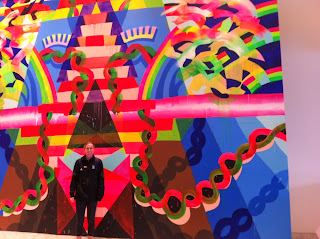
As Dr. Vilain continued with his presentation, he began referring to Forrest Bess’s artwork and how it portrays symbolic representations of both male and female genitalia. An important piece of his talk that I thought was very interesting was the fact that Forrest Bess uses different colors throughout his paintings to show the distinction between male and females. The color red represents masculinity as the color white represents femininity. Forrest Bess’s pieces of art were his way of expressing his own inner conflict and how he was dealing with coming to terms with his identity/physical conditions. Dr. Vilain expressed that throughout his artwork, Forrest Bess was able to come to terms with his own sexuality. 
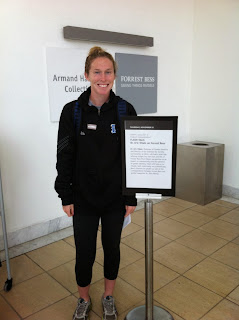
In front of Forrest Bess "Seeing things Invisible" exhibition 
This event was very different however it provided great information on how artists tend to use their artwork as a way to express their personal and inner struggles. Forrest Bess’s artwork incorporated not only intricate designs to appeal to the viewer but it also displayed and attempted to show the viewer “invisible things”. This is in fact the title of his gallery and with Dr. Vilain’s presentation, I was able to get a better grasp on what in fact Bess was trying to express through his artwork. Forrest Bess used his artwork as a way to incorporate the human body and illustrate both the male and female genitalia. 

Sources: (No pictures were allowed in the gallery)
Image #1: Dr. Eric Vilain. http://socgen.ucla.edu/people/eric-vilain/ 
Event #3- Hammer Museum


Every time I am driving around Westwood, I always happen to find myself passing the Hammer Museum. I have always been interested in what is inside, but never seemed to follow through in actually going inside. However, seeing that I needed to attend 3 or more events, the Hammer Museum was definitely going to be on my lists of places to go. I found myself walking into the gallery of James Welling- "Monograph". His pieces of art were very unique/abstract and it was evident that he preferred using color in his work. I found myself being gravitated towards his art piece called “Glass House (06-09)”. I was in awe by the vibrant colors that were radiating from his photographs and I couldn’t help but get closer to the pictures to see exactly what was happening in the frame. The title of this photograph series explains it all as he photographed a glass house. However, what makes these photographs unique and ones that stand out from many other photographer’s pictures is that he used color filters in front of the lens to enhance the house in the photograph. By adding the colored filter in front of the lens, the glass house appeared to be very animated and lively. It was stated on the information card beside the photographs, that James Welling returned back to the house over 12 times, over the course of 3 years. I find this to be extremely interesting because it illustrates just how much time and commitment he invested into getting these particular photographs of the glass house. 
James Welling's photograph: "Glass House"
By simply adding the color filter in front of the camera lens, James Welling intended on capturing the line between what he says is, “real and imaginary”. After studying these photographs it is evident that he executed his intentions. Welling’s used his knowledge of optics to enhance and show the different amounts of light that was present in the different photographs of the glass house. Each photograph had the same glass house, however each one had a different color filter and appeared to have various amounts of light in each image (This is shown below in the two images). 


James Welling’s gallery was one that I enjoyed walking through and looking at the different and abstract photographs that he took. It is always entertaining when the image captivates your attention and makes you think about what the image is/what it is about. Welling’s gallery was not like any other that I have been to before because of the bright colors that radiated off of the photographs. Welling was able to capture abstract images and designs and visually express them through his photographs.


Sources: (No pictures were allowed at the gallery)
Image #1: James Welling. Glass House. http://jameswelling.net/projects/14
Image #2: James Welling. Glass House. http://jameswelling.net/projects/14 
Image #3: James Welling. Glass House. http://jameswelling.net/projects/14

Event #2- Getty Center


For my second event, I decided to take a visit to the Getty Center that is located minutes from UCLA’s campus. I have visited the Getty Villa in Malibu a couple of times but this was my first time at the Getty Center and I am so glad that I was able to visit there. After taking the tram to the top of the hill, where the galleries are located I was already taken back by the amazing views over LA and the ocean. The exhibition that I saw was of Abelardo Morell’s photographs. As I walked around the room, one of his pieces of work that intrigued me was his photograph called, “Microcosmos”. I stood there for a couple of minutes before reading the information card on the side wall and tried to see for myself what exactly it was that Abelardo had photographed. At first glance the picture looked as if it were outer space. However, there was more to the picture than meets the eye. The photograph was in fact an image of water that was sprinkled on film. His vision and ability to capture such a unique moment of the water on the film was illustrated through this photograph. His close attention to detail was prominent in this photograph and it was remarkable that he was able to capture such a specific moment. I recall a little girl walking behind me as I was standing in front of the image and when she muttered to her mom, “Mom look that’s outer space!”, I couldn’t help but turn around and say that I thought it was too.
Image of Abelardo's work: "Microcosmos"
Another interesting aspect of Abelardos’ photographs is that he experiments with what is called camera obscura. There were four photographs that were lined up together along the same wall and each were titled by the particular season, “Summer, Winter, Fall, Spring”. Each photograph was taken at the same angle and of the same backdrop, however depending on the different season the backdrop appeared to be different. This helped illustrate the change of scenery and time period while at the same time showing that inside the room remained the same. The obscura in his photographs that he experimented with was very unique and helped to enhance the objects/places/things that he was capturing. In order to capture this "obscura", it was necessary for Abelardo to have the room in complete darkness. He used the window as a way to capture what was taking place outside and it appeared on the photograph upside down from the rest of the room. By capturing the outdoors and the seasons changing through the same window of space and taking the picture from the same angle, Abelardo was able to bring all four photographs together and show the connection between one another. Even though the seasons changed and were shown upside down in the background, the photographs forefront remained unchanged. 


I definitely learned a lot after observing Abelardo’s photographs. He showed through his work how even the most simple things, like water falling onto film can be captured and turned into a beautiful and appealing piece of art. I enjoyed this event and found it to be extremely entertaining. As I was leaving the room filled with Abelardo’s work, the last thing that I wrote down as I was taking notes was a quote that he said that really put everything that I had just observed into perspective. He said, “Photography is still raw and unexplored”. His pieces of work definitely demonstrated this attitude, as his photographs were his way of experimenting with photography. 
At the Getty Center :)
Sources: (No pictures were allowed at the gallery)
Image 1: Abelardo Morell. http://www.abelardomorell.net/posts/photograms/ 
Image 2: Abelardo Morell. http://www.abelardomorell.net/posts/camera-obscura/ 
Image 3: Abelardo Morell. http://www.abelardomorell.net/posts/camera-obscura/

Event #1- "Punk Arcade"


Event #1:
At the event: "Punk Arcade"
The first event that I attended this quarter was a one-night exhibition called “Punk Arcade” and it was located at the Broad Art Center on UCLA campus. This event could only be made possible with the work from artists, designers, students, and filmmakers who came together to construct “do-it-yourself”/handmade video games. As I approached the building I could hear laughter and the talking coming from the room and I was excited to see what this whole event was about. As I walked into the building, I noticed that these video games were very different in the sense that they weren’t typical mainstream products, they weren’t put together in a neat manner, and some were very large and uncommon. 

At this moment after scanning the room and the various video games, I started to become more open and understanding seeing that these video games were not ones that needed to be approved by any toy or gaming company, but rather they were an expression of the individuals who constructed them. One of the games that caught my attention for most of the time that I was there was called, “Distribution of Wealth” created by Michael Wilde. This game required the player to control the character, in this case the designer intended for it to be Johnny Rotten (the lead singer of the Sex Pistols). The player had a command station that is shown in the picture below and they were able to move around the joystick which enabled “Johnny Rotten” to move around on the screen. 

This game reminded me of “Pac Man” because it is a game where the player aims to gather funds, which were money signs on the screen and trying to avoid what the designer describes as “Corporate Fat Cats”. By incorporating this political spin, the designer was able to put his own mark and opinion into the game. This clever addition to the game illustrated how this event was open to individuals expressing themselves anyway and by any means. This game brought together both fields of technology and art because it allowed the designer to use technology used to create video games as well as having the freedom to add his/or her personal and artistic touch.
 The Punk Arcade was a very different event and was one that opened my eyes to see how the public has the capability of using their artistic abilities to make video games. It amazed me that these video games were constructed in just 3 days and the designers were able to bring together both their knowledge with technology/gaming software and their creativity to create a stable/functional video game. 

Sunday, December 1, 2013

Week 9- Space and Art


Scientists have explored and researched for many years about space and the universe that we live in. They continue to discover new and incredible information that not only makes you think about your existence but fascinates you so much you want to learn and find out more information. The video that was presented in lectures this past week called, “Powers of Ten”, was mind-blowing. As the video started out with just a clear image of a picnic in Chicago, it was noticeable that once the video started to expand its field of view 10 times wider, that the picnic that seemed so large at first now became this little spec in the frame. As the camera angle continued to get higher and higher, the images of our country, earth, and solar system quickly diminished and finally came to a stopping point that was outside of our galaxy. After watching this video, it provides a clear illustration of how vast and endless our universe truly is.
Images from the "Powers of Ten" video
Space research has been persistent for quite some time and scientists have been able to discover aspects of space that seem to be incomprehensible. One of the most influential discoveries was the “Heliocentric” description of the solar system, which was discovered by Nicolaus Copernicus. His discovery changed the way people viewed the universe as he found that the sun was the center of the solar system, which was in opposition to the previous notion that the Earth was at the center. With Copernicus’s discovery, as Professor Vesna explains in lecture it was the, “first time we scientifically had the sun as the center of the solar system,” (Vesna). 
Image of Copernicus's "Heliocentric" description of the solar system
This week’s lectures on “Space” revealed a lot of information that I was unaware of. One of the most interesting pieces of information that I learned from this week was the designing of space flights. The owner of Virgin, Richard Branson and the designer of the spaceship called, “Spaceship One”, together are planning to “commercialize space flights in two or three years’ (Vesna). These flights that will be offered to go to space, illustrates how amazing Space is and our fascination with it. Although the flights will be offered at a great price of $200,000, the fact that individuals will have the ability to see and explore space in a couple of years through commercial flights is astonishing and something that I would never have thought was possible. With the design and construction of these spacecraft, it helps show that we are eager to expand upon our knowledge of what we know about space and what there is still to learn to about space.  
The Virgin Space flights ready to launch in the next couple of years
Sources:
Wikipedia. Copernicus. http://en.wikipedia.org/wiki/Nicolaus_Copernicus
"Array." Research – Conducting Research on SpaceShipTwo and WhiteKnightTwo. Web. 01 Dec. 2013. http://www.virgingalactic.com/research/   
Image 1: Wikipedia. Heliocentric. http://en.wikipedia.org/wiki/Heliocentrism 
Image 2: "Responsible Nanotechnology." Web. 01 Dec. 2013.http://crnano.typepad.com/crnblog/2008/05/powers-of-ten-in-years.html 
Image 3:  "Flights of Fancy: Virgin Galactic Plans Space Hotels, Day Trips to the Moon: Scientific American." Web. 01 Dec. 2013. http://www.scientificamerican.com/article.cfm?id=virgin-galactic-space-hotels